

An Insider Fix For The Costly Email Sign-Up Mistake
Picture yourself at the kitchen table on a quiet Tuesday morning, a mug of tea going cold beside the laptop. You are checking the page where visitors sign up for your free retirement income guide.
You built that page to grow your email sign-ups, and on its own the offer is a fair one. A free guide, a clear headline, a promise worth opening an inbox for.
Then you look a little closer, and notice everything else sitting on that same page. A link to your course. A row of social icons. A menu bar across the top, still switched on from the day you first built the site.
None of it looks like a mistake, taken one piece at a time. Together, it may well be the reason your email sign-ups have slowed to a trickle, however good the offer underneath it all happens to be.
If what you really want is a system that works even if you are not technical, this is worth five minutes of your attention. The fix costs nothing beyond a little tidying.
Why A Crowded Page Costs You Readers
A visitor rarely lands on your sign-up page by accident. They arrived with one problem on their mind, looking for one clear next step.
The moment your page hands them four or five possible next steps instead of one, their attention splits. A link to your course here, a social icon there, a menu they could wander off into without ever reaching the button.
Each extra choice feels harmless on its own, which is exactly why it survives. Nobody sits down and deliberately clutters a page. It happens one small addition at a time, over months. Eventually the one job the page was meant to do gets buried under everything else it has quietly taken on.
Think of the last few sign-up pages you may have seen elsewhere, the ones that ask for nothing but an email address and offer one plain reason to type it in. Compare that to a page carrying a top menu linking back to six other pages, a sidebar promoting three products, and social icons sending visitors away before they have even read the headline. The crowded version might generate plenty of clicks, just not the one click that matters.
The Habit Hiding In Plain Sight
Open your own sign-up page right now, in a new browser tab, and count every clickable thing on it. Buttons, links, icons, menu items.
Write the number down.
Most pages built to collect an email address carry four or five competing choices rather than one. A mind faced with several options at once will often default to the simplest option available. That default is to do nothing at all and close the tab.
I touched on a related idea about keeping things simple when you are building an online income later in life, in other articles I have shared recently. It is worth returning to here, because this is where that simplicity matters most.
Give a visitor one clear door, and most of them will walk straight through it.
Give them five doors instead, and most will simply turn around.
What I Changed On My Own Sign-Up Page
I rebuilt my own sign-up page recently inside eShowcase. It is where I keep my pages, my list and my email all in one place. I stripped it back to one headline, one short line explaining the benefit, and one button.
Everything else came off. The social icons went. The menu across the top was switched off. The second offer further down the page, the one I had added months earlier “just in case”, was removed entirely.
Before the change, a first-time visitor could click through to five or six different places without ever reaching the button. Afterwards, there was exactly one thing to do, and nothing else competing for the click.
Underneath one button, I added a single plain sentence: you will receive the guide by email within a few minutes, and nothing else. That one line quietly answers a fear most visitors never say out loud. It is the worry that signing up leads to a flood of unwanted offers landing in their inbox.
None of this required new writing skills, new software, or hours spent at a desk. It is the sort of change anyone can make in an afternoon, whether or not marketing has ever felt natural to you.
A Five-Minute Check You Can Run Today
Look at your own page with one honest question in mind for every item on it. Does this help a visitor sign up, or does it give them a reason to leave instead?
Anything that fails that test gets removed, hidden, or pushed well below your main button. Nothing stays simply out of habit.
On my own page, that question removed a link to a blog post I was proud of, a badge for an industry association, and a countdown timer nobody had looked at in months. None of it was wrong by itself. Together it was noise standing between a visitor and the one thing the page existed to do.
Run this same check once every few months. Pages collect new links quietly over time, the way a kitchen drawer collects odds and ends. Every one you add makes it that much harder for your email sign-ups to grow the way you want them to.
If a little more explanation is needed before someone will hand over their email address, that is fine. It should arrive in stages rather than side by side. Show one short question. Then the next, once the first is answered. Your visitor still only ever faces one decision at a time.
Why This Matters More Than It Looks
You can write a warm, honest offer. You can choose a clear headline that speaks directly to someone worried about outliving their savings, or wondering whether it is too late to try something new.
You can still lose most of those readers to a page asking too much of their attention before they have even decided to trust you.
This is not a writing problem. It is a focus problem, and focus is the one thing a crowded page is always missing.
Fix the focus first. The words you already have will very likely start working harder the moment they are the only thing competing for your visitor’s attention. Every subscriber you gain this way costs nothing extra, because the traffic was already there.
Give Them One Door
You do not need to rebuild your whole site this week. You need one page, cleared of everything that is not the sign-up itself, with one clear line telling your visitor exactly what happens next.
Pick the page that matters most to you right now. Clear it this week, and watch what happens to the numbers.
Residual income for the years ahead rarely starts with a clever trick. It starts with small, deliberate tidying like this, repeated often enough that it quietly compounds.
Kind regards,
Angus
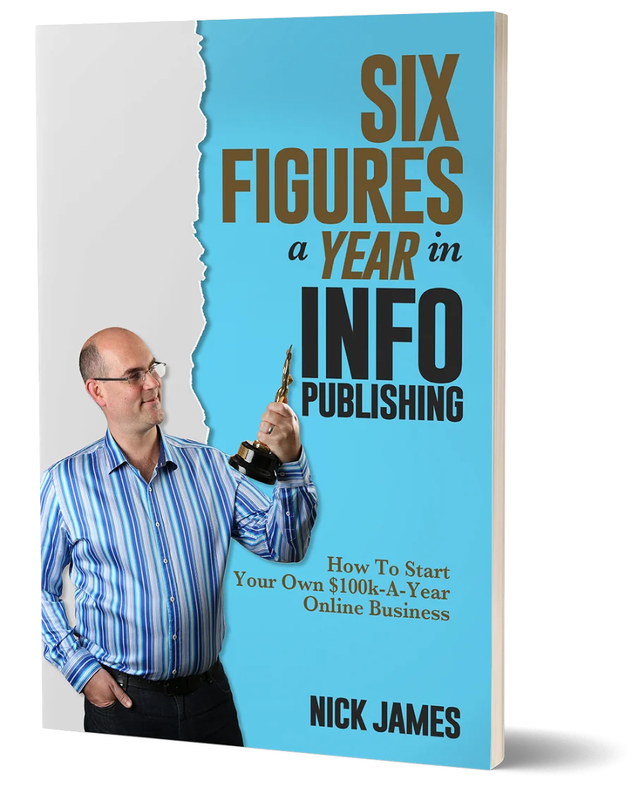
Author offers a FREE copy of this book to his next door neighbor... to prove he's not a drug dealer!
Now claim your FREE COPY.
and follow the step-by-step instructions for making the kind of money (and living the kind of lifestyle) that'll get your neighbors curtains twitching with curiosity!
Enter your details below to discover how to claim your FREE COPY of 'Six Figures A Year In Info Publishing' ...
Privacy Policy : We value your privacy. You can unsubscribe from receiving future emails with 1 click at any time.


